The peak
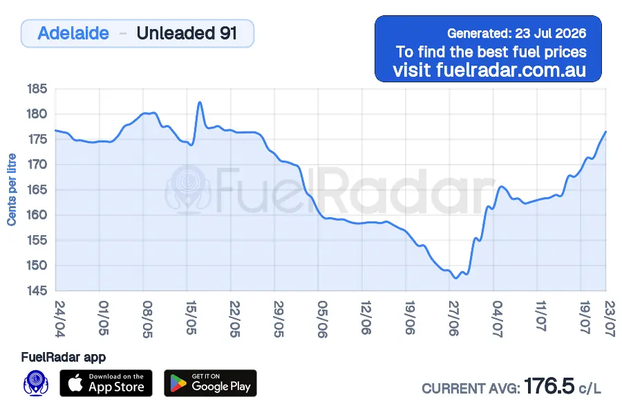
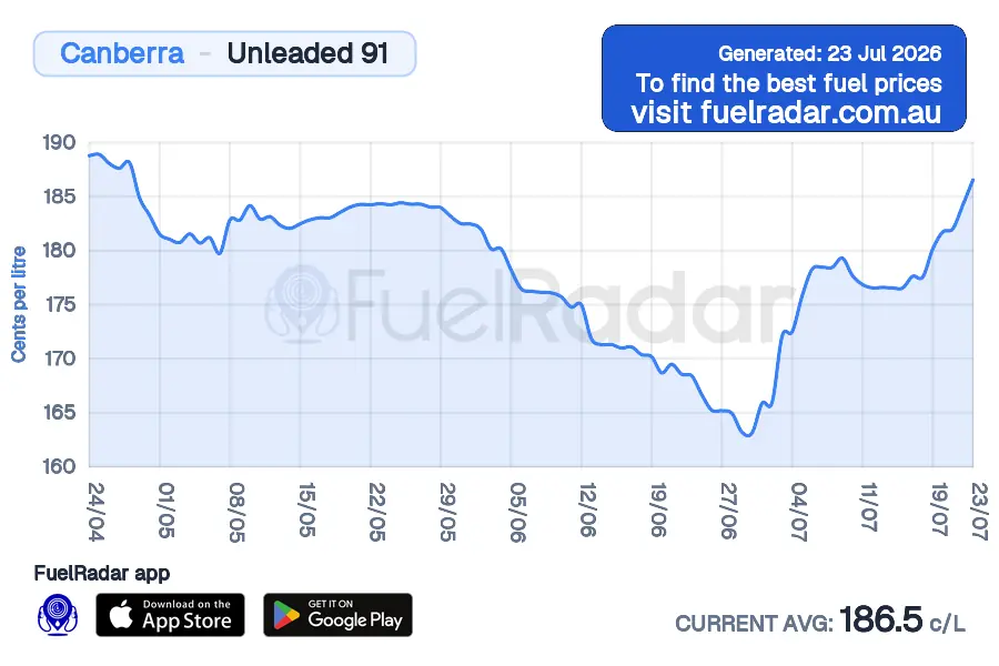
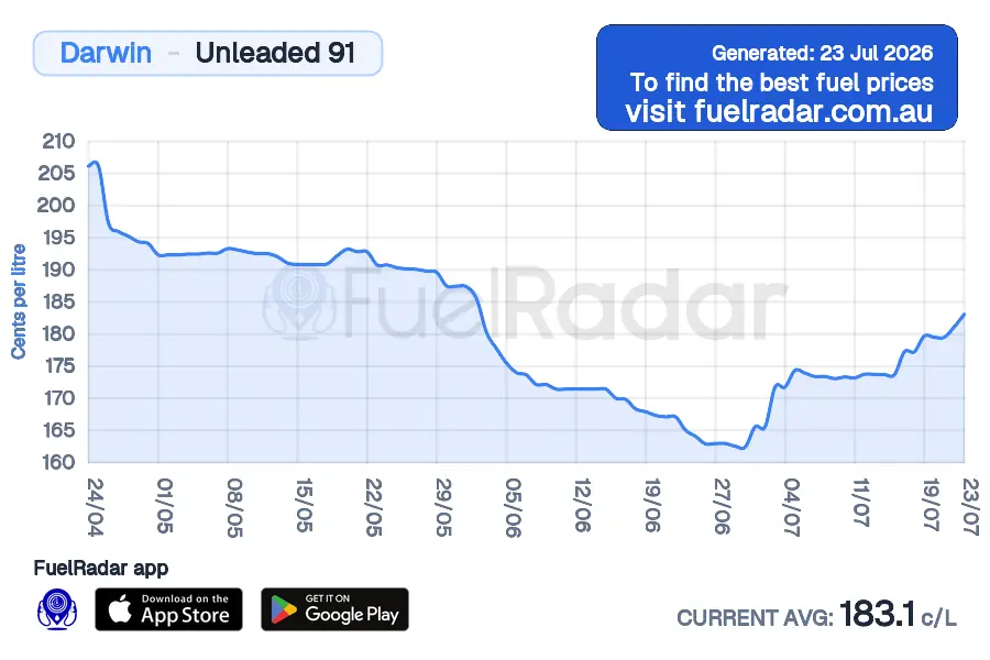
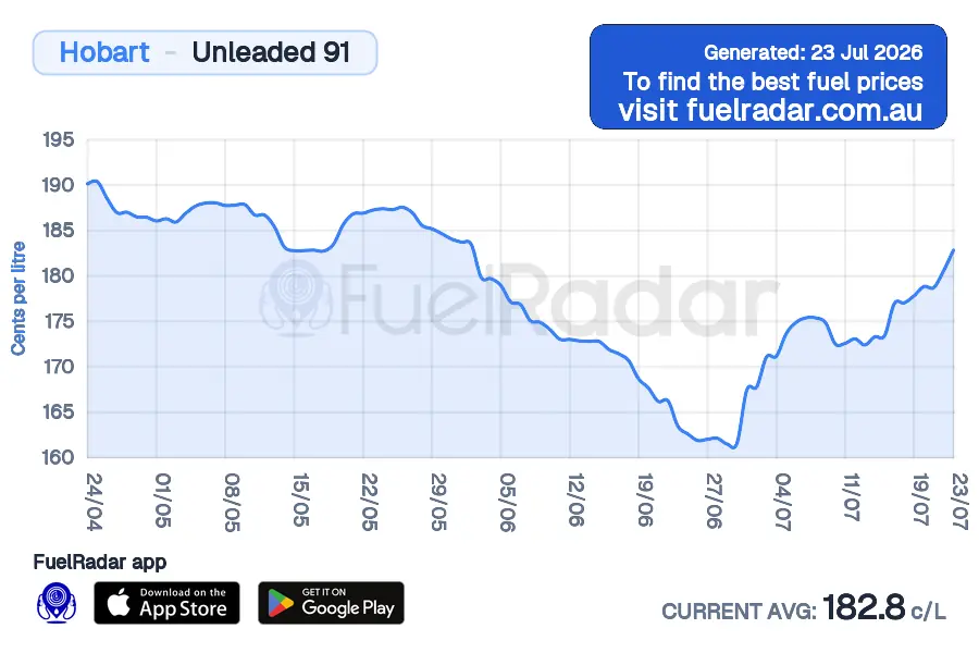
The chart jumps up sharply. If your tank can wait, compare nearby prices before filling straight after a rise.
Analytics
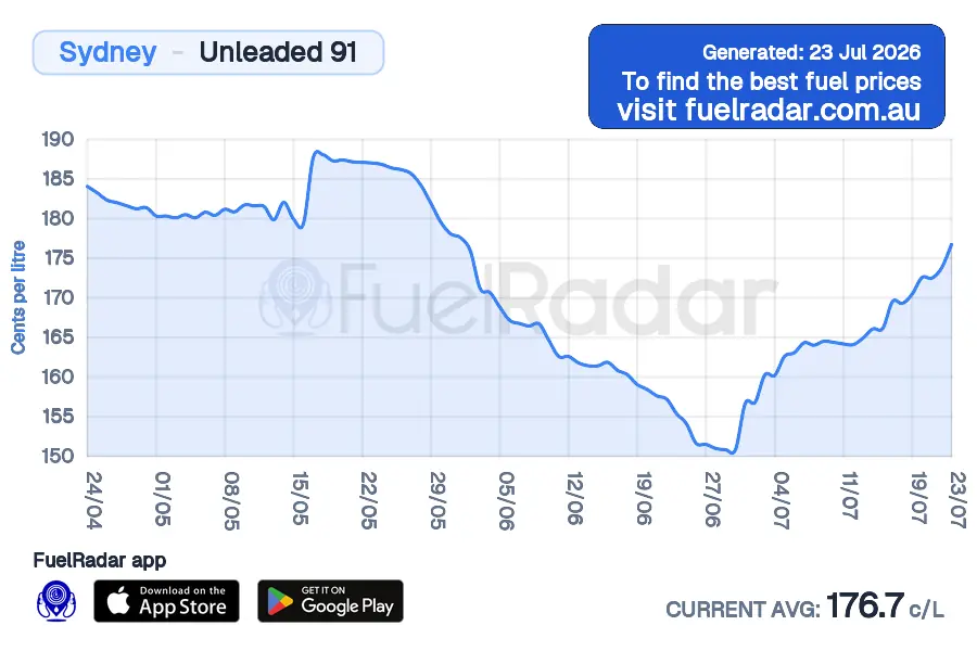
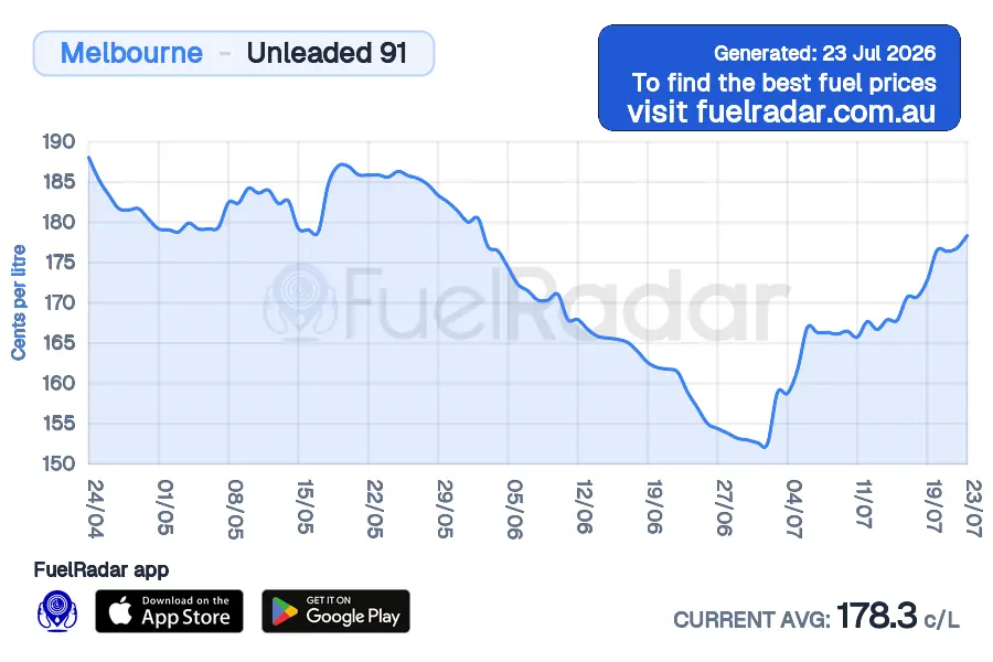
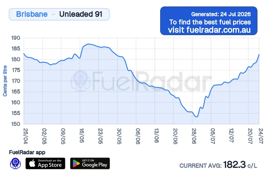
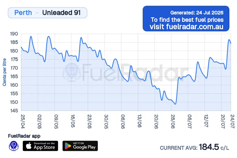
Retail petrol prices move in repeating patterns across major cities. Read the cycle, then compare stations before your next fill-up.
U91Australia90-day charts

Reading the chart
The chart below shows the rolling 90-day average price. Look for the repeating sawtooth shape: a sharp jump, then a slow decline. Read where today sits in that pattern.
The chart jumps up sharply. If your tank can wait, compare nearby prices before filling straight after a rise.
Prices can settle lower before the next reset. If the chart and station list both look favourable, filling more of the tank may make sense.
Watch the spacing between peaks. Major city cycles can be uneven, so treat the next jump as guidance rather than a guarantee.
FuelRadar
Loading current fuel data
Reported prices and update times are being prepared for this page.
Common questions
Retailers reset prices to recover margin after a discounting period. A market leader may move first, then competitors can follow within hours.
Each city shows whether petrol prices sit closer to the lower or higher part of the cycle. Premium 95, premium 98 and E10 can move similarly, but check the station price before driving.


Source: FuelRadar Australia data.
Source: FuelRadar Australia data.
Source: FuelRadar Australia data.
Source: FuelRadar Australia data.
Source: FuelRadar Australia data.
Source: FuelRadar Australia data.
Source: FuelRadar Australia data.
Source: FuelRadar Australia data.
In major cities, petrol prices can jump quickly, then drift down over days or weeks before moving again. That repeating saw-tooth is the price cycle.
Retail pricing drives the cycle as well as wholesale costs, so check its position before you fill.
The length and size of the swing change from city to city and over time. Watching the cycle helps you decide when to check prices again.