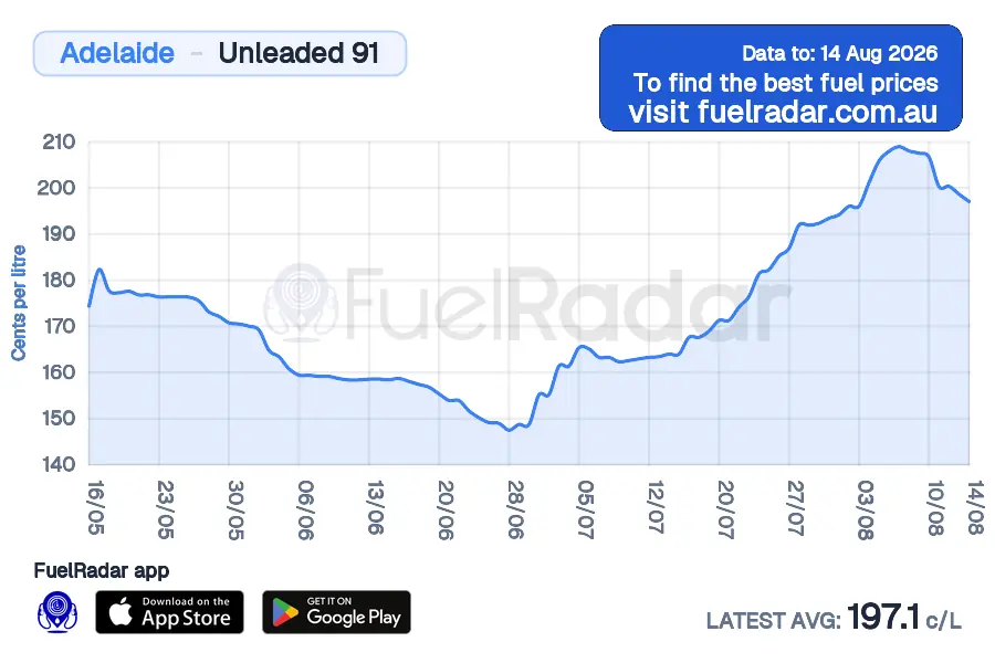
Unleaded 91 Price Cycle in Adelaide
See where Adelaide sits in its current petrol cycle, then check station reports before you fill.
Unleaded 91Adelaide90-day history

FuelRadar
Loading current fuel data
Reported prices and update times are being prepared for this page.
How to read the Adelaide price cycle
The 90-day history can show a sharp retail rise followed by a slower decline. Use the latest station list to confirm what is available today.

After a rise
Compare nearby stations because retailers do not all move at once. The chart cannot guarantee the next change.
As prices ease
Check whether the city average and current station list are both moving lower before deciding on a larger fill.
Variable timing
Adelaide's cycles can change in length. Use the dated series instead of relying on a fixed weekday.
Petrol price cycle questions
Retailers reset prices to recover margin after a discounting period. A market leader may move first, then competitors can follow within hours.